When it comes to design and UX, responsiveness is the first thing that comes to mind. It’s important to ensure a responsive table design so that the content is visible and readable.
Ninja Tables gives you control of your table’s responsiveness, so you don’t have to worry about your tables fitting into different device screens.
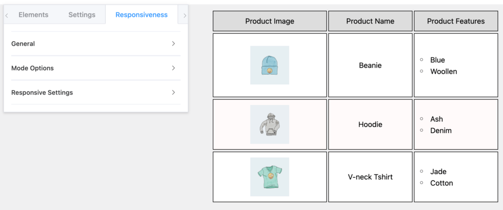
You can find this option on the leftmost side of the Table Editor and see the responsiveness setting is turned on by default.
Properties of Responsive Table Design #
| Option Name | Type | |
| General | Enable Responsive Table | Toggle on or off |
| Mode Options | Mobile | Toggle, dropdown, numeric |
| Tablet | Toggle, dropdown, numeric | |
| Desktop | Toggle, dropdown, numeric | |
| Responsive Settings | Mobile | Numeric & radio button |
| Tablet | Numeric & radio button |
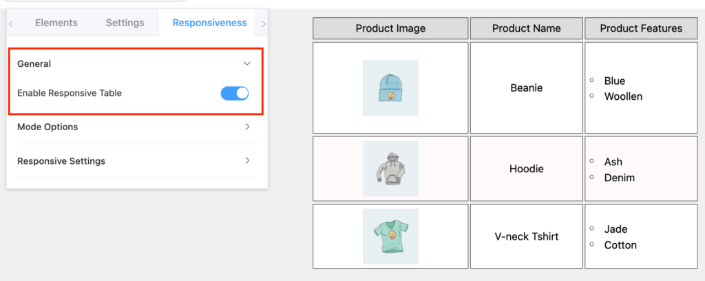
General #
Enable the table to be responsive by toggling the button on.
Mode Options #
Mobile and Tablet: From here, you can customize the responsiveness on mobile and tablet. Both the options have the same customization directions.
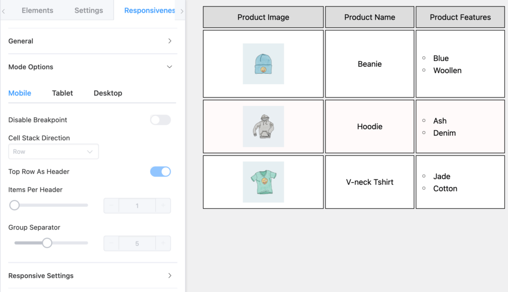
- Disable Breakpoint will only work when the “Enable Responsive Table” mode is toggled on.
- Cell Stack Direction works when you turn off “Disable Breakpoint” and change the direction of cells stacking as rows or columns.
- Toggle the “Top Row as Header” option.
- Control the number of Items Per Header.
- Select Group Separator.
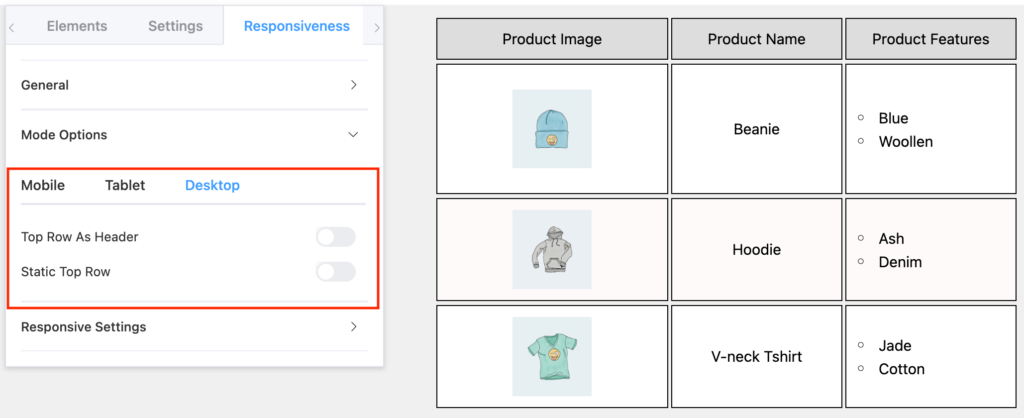
Desktop: This is where you can change the header and row position for a desktop view of the table.
Responsive Settings #
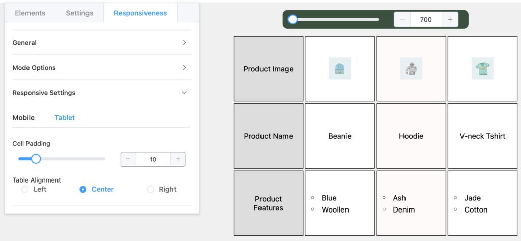
You can change Cell Padding and Table Alignment for mobile and tablets the same way.
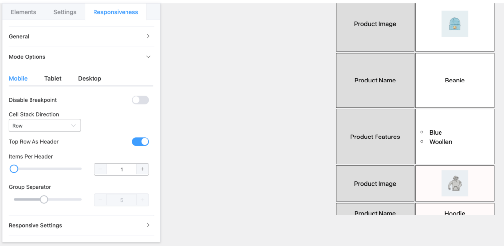
For example, here’s the same table as mobile responsive with its top row as a header, 1 item per header, and “Rows” for Cell Stack Direction.
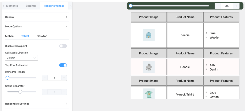
And we can also show you another responsive table on a tablet that has the top row as its header, cell stack direction “column”, and 1 item per header.
Conclusion #
A responsive table design is a must to keep your audience engaged. Since everyone is now a mobile-user, you can’t deny them a good UX. Make your data tables responsive for all devices.
Let us know your thoughts.

how to change Group Separator color ?
Hello Ameer,
Thank you for reaching out here. Our support team can help you with this issue. Please open a support ticket from here: https://wpmanageninja.com/support-tickets/
How to change responsive breakpoint for tablet from 1024px to say 1280px
Hi Sreehari,
You can easily change responsive breakpoint of your tables for any device size. Please open a support ticket https://wpmanageninja.com/support-tickets/ to let our support team help you with that